Brief
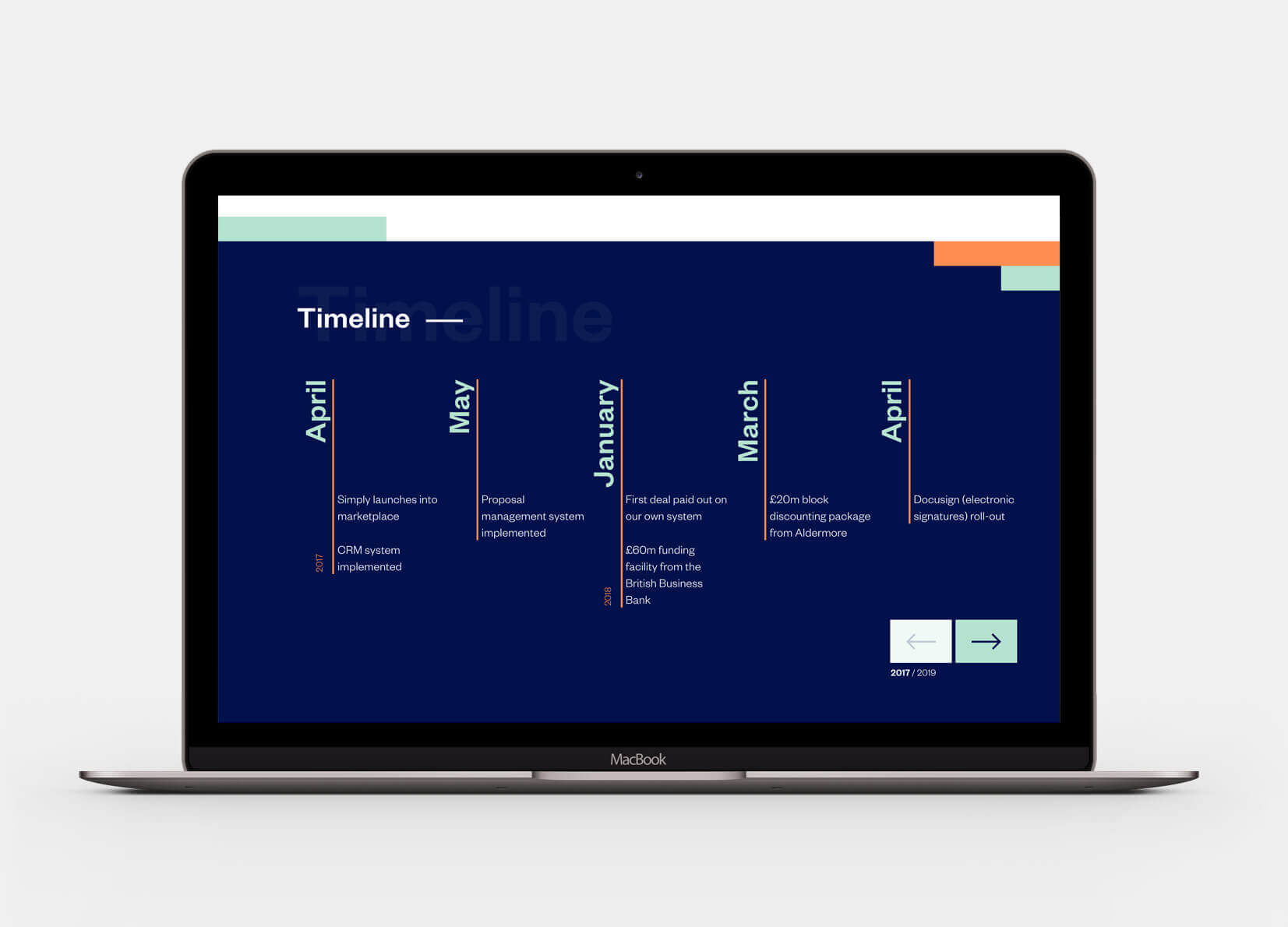
Simply are an asset finance company that are relatively new to their market, they have shown impressive growth since January 2017 which makes them enviable competition in their respective sector. After a comprehensive re-brand, the final element that needed to be updated was their website, as the first touchpoint for the majority of their clients this needed to reflect their new positioning and stand out against the competition.
Starting with their old website, I carefully considered what needed to be implemented into the new design by drawing up a new sitemap, from this I then created mobile wireframes that organised their existing content into an improved structure which would make it easier for new users to find information quickly and without struggle. Once the wires were approved, the design of the website had to rapidly take shape as there was a 10 week turnaround for it to be designed, tested and launched.
The new ‘Simply’ brand colours are bold and fresh, which I used throughout the site in a fun but user friendly way. I also then looked at using the ‘hyphen’ mark dynamically throughout the site as a fun loading animation that occurred as you scrolled down each the pages.
Playful micro-interactions, animations and iconography are used throughout the site to give it a more ‘personal’ feel which was important to Simply as they pride themselves on empowering their customers by being the best in their market. As they continue to grow I felt it was important to have a dedicated careers page that allowed potential new employees to see why they should come and work for Simply. The careers page has testimonials from current employees, highlights their working ethos and easily allows users to submit their CV directly to Simply by using an integrated form on the page.
Credits
I was Lead Digital Designer on this project whilst working at Deep. Photography © Simply.
+12%
DWELL TIME
+35%
USERS
+43%
RETURNING USERS


The online application form allows potential new employees to easily upload their CV and get in touch with Simply without leaving the website.


New customers can easily find what they are looking for with the simple site search feature on the homepage which directs them to the relevant page once they’ve identified what they need help with.


